H.O.P.E.
Partners of Farmington
What We Deliver
Logo Design
Brand Identity
Website Design & Development
OMS: Ongoing Marketing Support
Challenge
Formerly Services for the Elderly, H.O.P.E. Partners of Farmington needed a complete makeover. Their team wanted to bring more attention to the services they offer to the community, while bringing their website into modern times. Together, we built a website and online presence that highlights the work that H.O.P.E. Partners does for their clients and resonates with the community at large. Their commitment to serving those who are in need, while also being an active member of the community radiates through their website.


Approach
H.O.P.E. Partners of Farmington was a labor of love, we began by understanding the short comings of their current website and limited online presence. Our goal for this website was to create something that could be used by all ages, highlighting the ease of use. Another goal was to emphasize that while most of the programs are tailored to home-bound seniors, anyone can benefit from their programs. With a thoughtfully designed website, we were able to showcase H.O.P.E.’s unmatched community outreach. Working diligently together with the Board of Directors, we presented a website that shines a spotlight on their commitment to making our state better for all.


Logo
As they approach their 60-year anniversary of providing services to local and other communities, H.O.P.E. Partners of Farmington wanted to pay homage to one of the founders, a well-known asset to the community, Hope Emery. This is reflected in the logo and color palette. The illustrations of humans “jumping for joy”, conveys a feeling of hope and personifies the brand. The color palette was inspired by Hope’s hazel eyes, further solidifying the honor. The use of blue creates a calming sense through the site while bringing in the color maroon connects to the town of Farmington as it is one of the main colors for the high school.

Design & Dev
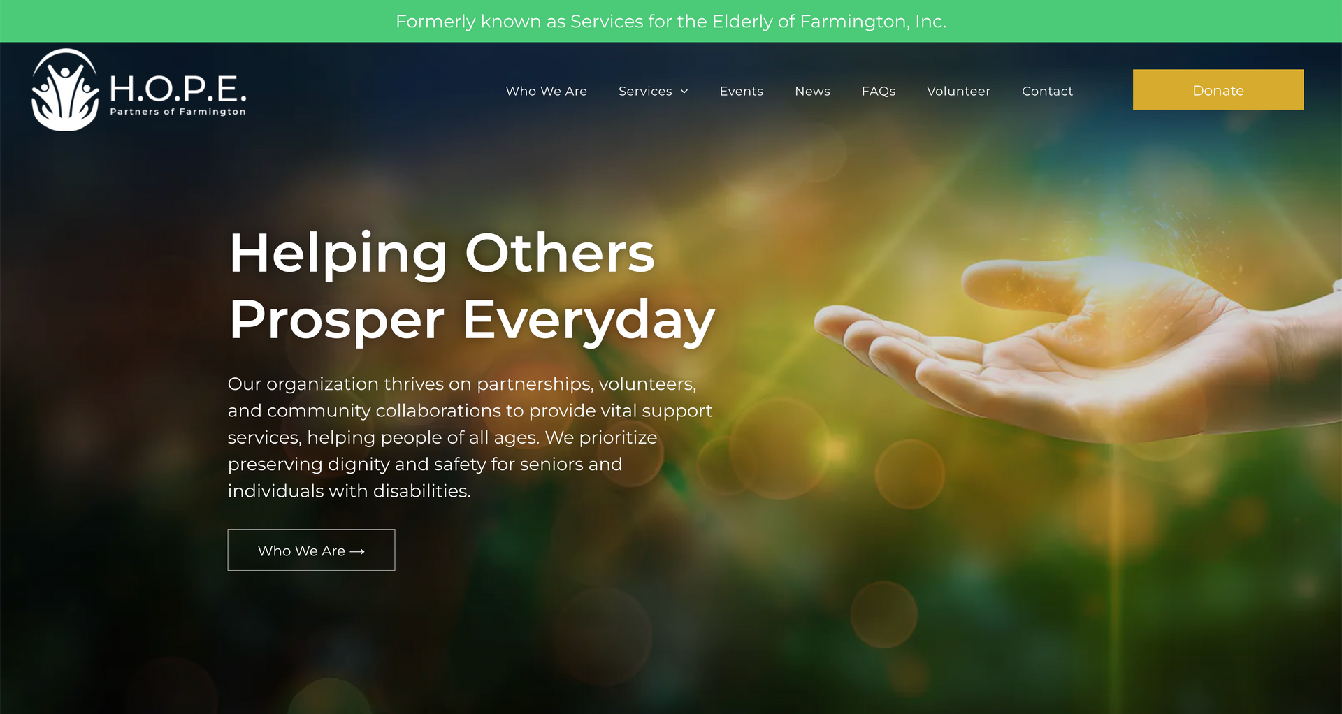
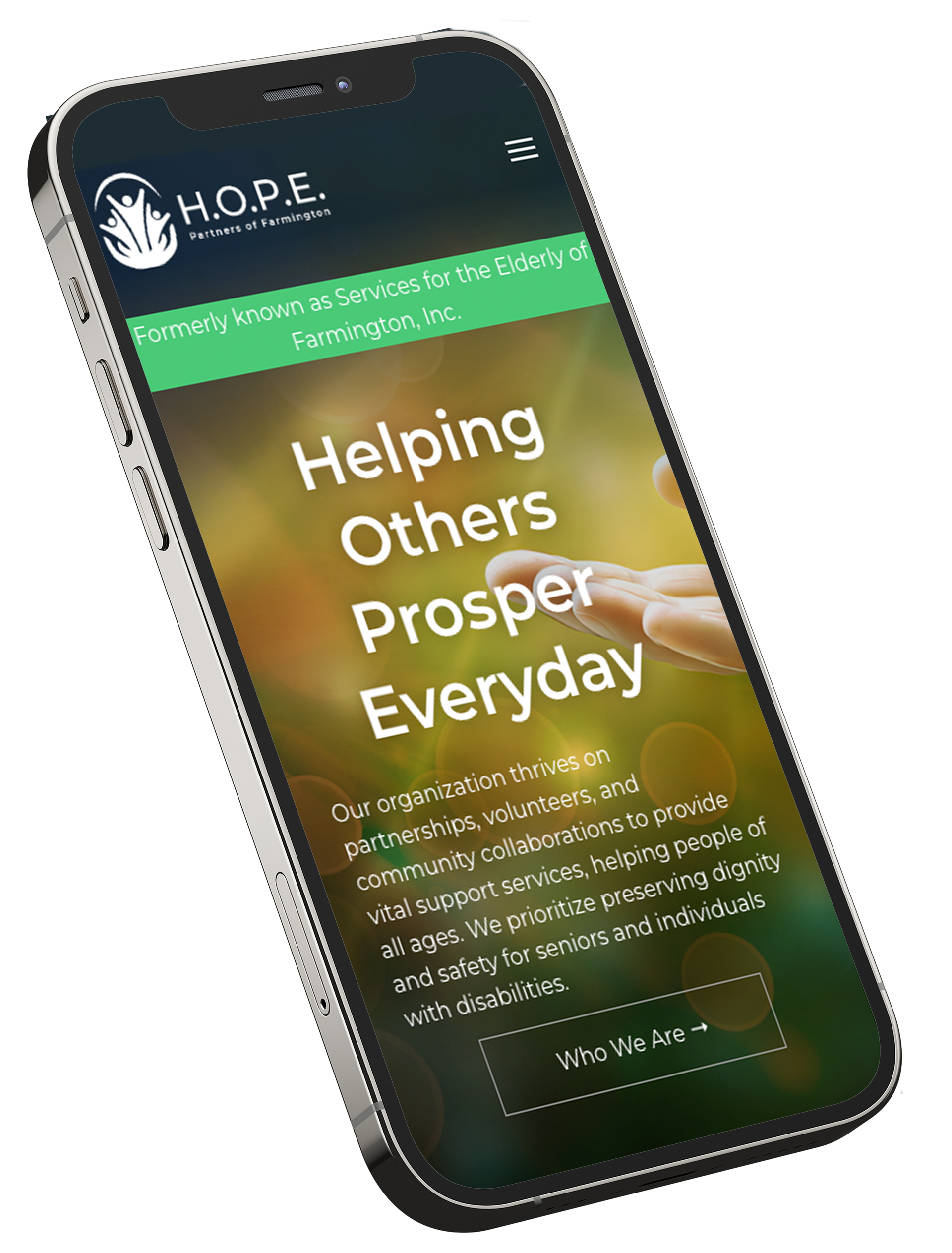
The H.O.P.E. Partners of Farmington website presents a warm and inviting presence that aligns seamlessly with the organization’s mission to unite volunteers in supporting home-bound individuals. The design incorporates a soothing color palette, featuring primary tones of blue and hazel, which enhances visual appeal while promoting a sense of calm.
Compared to its previous iteration, the updated website is noticeably less cluttered, improving accessibility for a diverse range of users. High-quality images showcasing community members, volunteers, and program activities are thoughtfully integrated throughout the site, reinforcing a strong sense of connection and emphasizing the organization’s dedication to delivering essential services.
The typography is clean and highly legible, utilizing a sans-serif font that contributes to a modern aesthetic. The navigation is well-organized, enabling users to easily locate information about available programs, donation options, volunteer opportunities, and more. A prominent “Donate” call-to-action is consistent in the footer, encouraging visitors to support the organization financially as a meaningful form of engagement.
Overall, the H.O.P.E. Partners website effectively communicates the organization’s commitment to enhancing the dignity, safety, and well-being of seniors and individuals with disabilities. Its thoughtful design and user-centered layout ensure a positive and accessible experience for all users.